Skip to content 5.6Flick
 6.9Flick
 6.5Flick
 7.4Flick
 4.5Flick
 4.3Flick
 5.7Flick
 7.0Flick
 4.8Flick
 5.6Flick
 4.0Flick
 6.1Flick
 5.5Flick
 6.3Flick
 7.1Flick
 4.9Flick
 7.9Flick
 7.5Flick
 6.6Flick
 3.4Flick
 5.2Flick
 5.7Flick
 7.7Flick
 5.4Flick
 4.5Flick
 6.3Flick
 6.6Flick
 4.5Flick
 7.0Flick
 6.2Flick
 7.5Flick
 6.6Flick
 6.0Flick
 5.0Flick
 4.7Flick

 6.9Flick
 7.8Flick
 2.6Flick
 5.5Flick
 3.2Flick
 5.1Flick
 5.6Flick
 6.0Flick
 5.8Flick
 5.3Flick
 7.1Flick
 5.2Flick
 5.4Flick
 5.6Flick
 6.9Flick
 7.0Flick
 6.0Flick
 5.7Flick
 6.8Flick
 7.7Flick
 4.7Flick
 5.7Flick
 5.6Flick
 6.0Flick
 2.4Flick
 4.0Flick
111 films
30 Minutes or Less
2011
Apparently I set this as the poster, and I think it was before I even made this list??
50 First Dates
2004
<p>This actually captures the movie’s narrative. The main poster just looks like she doesn’t want to be on a date with Adam Sandler.</p><p>(Just mind the fact that it’s an international poster).</p>

Alien: Covenant
2017
Dude stumbling upon an Alien egg with no protection gear or anything, like a moron. Everyone was dumb and this film sucks.
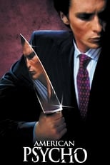
American Psycho
2000
<p>THEY REMOVED THE DIARY OF A WIMPY KID POSTER!</p><p><br></p><p>This is the closest that we’ll get to that. It fits well with my Wimpy Kid movie ranking list. Just mind the title being in another language.</p>
American Psycho II: All American Girl
2002
This movie was supposed to be an original film, not a sequel to <i>American Psycho</i>. Poster reflects the name change.

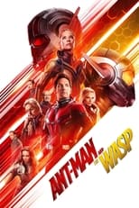
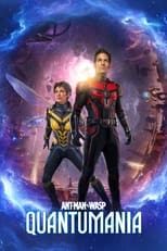
Ant-Man and the Wasp: Quantumania
2023
Movie was so mid that it didn’t deserve the small poster. This was my main takeaway from it.
Anyone but You
2023
This is the only one where they both look sick of each other, also it’s an actual poster and not a screen grab from the movie.

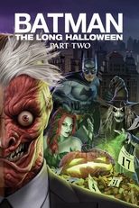
Batman: The Long Halloween, Part One
2021
Original poster didn’t line up properly with the other half.
Baywatch
2017
DON’T YOU GET IT?!? IT’S IN THE SHAPE OF A WIENER AND BALLS 🤯😹🤣 Also I chose the poster with The Rock and Zac Efron’s name on their because they’re both testicles for even making sure this movie exists.
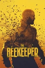
The Beekeeper
2024
Bees are hardly in the movie. The main character could be a sheep farmer and it still wouldn’t change the narrative.

Borderlands
2024
<p>Kevin Hart is Roland, aka the tall stoic cel-shaded character from the games. The Rock would’ve actually been a better choice, but he’s currently on career damage control so I get it.</p>
Click
2006
If you think about it, the remote is a gun. It caused so many problems that his life was in ruins, and he ended up dying early because of it.
Cocaine Bear
2023
In selecting the “Cokey the Bear” poster as my representative artwork for “Cocaine Bear” (2023) on Letterboxd, I aimed to delve into the subversive commentary it offers on societal norms and the subtextual layers of the film itself. This parody illustration of Smokey the Bear, reimagined with a sardonic twist, encapsulates the film’s audacious critique of both Americana and the inherent absurdity of our collective mythos.<br><br>The depiction of “Cokey,” with his sheriff’s hat emblazoned with a cheeky reinterpretation, serves as a potent metaphor for the twisted morality and chaotic underbelly that the film explores. By positioning a traditionally wholesome symbol of environmental stewardship into the throes of hedonistic excess, the artwork underscores the film’s thematic juxtaposition of innocence and corruption.<br><br>Furthermore, this poster wields a powerful aesthetic irony. The kitsch and cartoonish rendering of a drug-addled bear in a position of pseudo-authority satirizes the often simplistic, binary narratives propagated by both pop culture and public service campaigns. It reflects the film’s broader narrative arc, where the lines between predator and protector blur, thus challenging the viewer to reconsider preconceived notions of right and wrong within the context of nature vs. nurture debates.<br><br>In essence, “Cokey the Bear” is not merely an irreverent piece of pop art; it is a visual distillation of the film’s core tenets—chaos, irony, and the dark humor embedded within societal critique. By choosing this poster, I embrace the film’s ethos and invite viewers to engage with its deeper, albeit irreverent, narrative threads.
Cold Storage
2026
The fact that there’s a poster with Liam Neeson being photoshopped into the middle is kinda funny to me lol
Companion
2025
The default poster was just the main female lead looking happy, and I said to myself “isn’t this meant to be the movie where Jack Quaid is meant to be an evil/abusive boyfriend?”
Dear Evan Hansen
2021
Looks like he belongs in Zodiac, and Evan does lowkey remind me of the Zodiac Killer (movie would’ve been better if he was).

Demon Slayer: Kimetsu no Yaiba Infinity Castle
2025
<p>It’s the default poster but it has the tagline “The All-Out War Begins”, damn straight it is.</p>
Demon Slayer -Kimetsu no Yaiba- The Movie: Mugen Train
2020
Features my favourite character from this franchise 😢
Diary of a Wimpy Kid: Dog Days
2012
<p>Original poster didn’t have the shadows that represent their book counterparts. I had to do the app’s job for them…</p><p><br></p><p>My main nitpick, it should be Greg next to his dad since it’s about them.</p>
Diary of a Wimpy Kid: The Long Haul
2017
Looks like a knock off the original 3, and the film basically is that.
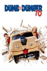
Dumb and Dumber To
2014
The mutts cuts van in the default poster is more for nostalgic marketing, it only appears for less than a minute for a joke (which I’ll admit is kinda funny).
Eight Crazy Nights
2002
I haven’t watched this movie, but I have watched the <i>Five Nights at Freddy’s</i> movie. Can we stuff the Happy Madison crew into animatronics? <b>Edit: </b>They removed the FNAF poster, but the <i>Undertale</i> one still exists. Can we have the Happy Madison crew fight Sans?



Eternity
2025
I way prefer this poster just for the juxtaposition, and the reference to the archive tunnel. I wished that the text was bigger though.

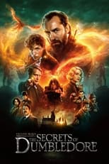
Fantastic Beasts: The Secrets of Dumbledore
2022
This is what he currently looks like<br><br>(they should keep recasting him if they’re going to make sequels)

The Final Destination
2009
Default poster just calls it “Final Destination”, they didn’t even bother adding a “The”. Well anyway this is the 4th film in the franchise.
Freakier Friday
2025
I don’t think it was mentioned in the marketing, but they swap with the children this time.


Grandma Got Run Over by a Reindeer
2000
Context in case they remove this poster: It’s an Oppenheimer fan poster

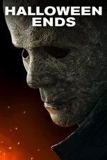
Halloween Ends
2022
The TRUE antagonist of the <i>Halloween</i> franchise. It’s Corey, and he’s in the house.
Good Boy
2025
It was called<i> “Good Boy</i>” where I watched it (or <i>“The Good Boy</i>” like the cinema suggests).
Home Again
2017
<p>I tried to find this movie on this app, and besides the main character being in the default poster, there’s nothing else to indicate that this was the movie that I had watched.</p><p>Just a shame that it was an international poster.</p>
Hoppers
2026
I don’t mind the yellow background posters, but c’mon reflection on the pond is so much cooler

How to Make a Killing
2026
How is this poster, with members of the family tree being crossed, not the default??



Jobs
2013
Not a single poster used his iconic black & white photograph. This international poster is the closest to that.
Joker: Folie à Deux
2024
Both characters are silhouettes of what we wanted them to be. It was all a facade.
Jurassic World Dominion
2022
GUYS… IT’S… ITS…. IT’S THE GUY FROM THE ORIGINAL JURASSIC PARK!!!
JS Bach: St Matthew Passion
<p>The true main character. Idk why that red furry was in this series</p>
KSI: In Real Life
2023
Had to include the Amazon Prime logo. Reflects well with how little the production team cared about online culture and making the most generic internet celeb doc
Lady Bird
2017
Original poster just shows her face, so that alongside the title makes it look like it could be some sorta fantasy/adventure. This captures teen angst.
The Last Airbender
2010
All the other posters looked really good. Had to choose one that matches the quality of the movie.


Little Man
2006
It’s about a thief, who disguises himself as a baby, and sexually harasses/assaults women… it’s like a comedic version of <i>Orphan</i>.

Madame Web
2024
I can’t lie, the other posters are actually way too good for this movie. Gotta have this one with the smug look and tagline on the bottom.

Mercy
2026
The default poster made it look like some sci-fi action film. The other poster is good, but the international one is just way better
The Monkey
2025
The tagline on top really reflects on what type of movie this is, a film that you expect characters from a movie to watch to gloss over how ridiculous it is.

Mortal Kombat
1995
Every Mortal Kombat movie on this app has to have to the MK Dragon logo in it

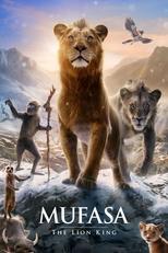
Mufasa: The Lion King
2024
Is that meant to be Mufasa and Scar in the poster, or Mufasa and his future grandchild? They all look the same.


Norbit
2007
It’s the same as the original poster, except it has the “HYSTERICALLY FUNNY” tagline.

Phineas and Ferb: Star Wars
2014
Why is it that this foreign poster is the only one that actually tries to replicate the original?
Pixels
2015
Can’t have a poster without our lovely Happy Madison Productions protagonists, right?
The Pope's Exorcist
2023
The pope on the scooter adds high level of personality to his character.
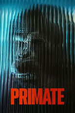
Primate
2025
The default poster uses the <i>PRIME</i> font, and the chimpanzee is hardly visible in it. This is a significantly better poster.

Queen of the Ring
2024
The composition isn’t great, but it establishes how Millie Burke boosted women’s representation in wrestling


Set It Up
2018
Netflix used this poster in their film catalogue, and I thought this was a different comedy flick starring Pete Davidson. It wasn’t, and he’s hardly in it.

Shark Tale
2004
<p>It’s about a fish that monopolises the sea world for his own gain.</p><p><br></p><p><b>Edit: </b>It was a <i>Wolf of Wallstreet</i> parody poster. I’m surprised it took them so long to delete it.</p>
Smile
2022
Although the woman in the poster is the one that causes the main character to go through a crisis, she’s also hardly in the movie. Plus this looks cooler.
Soul Man
1986
The movie is about a white guy pretending to be black. The default poster (and even banner) doesn’t even reflect on that
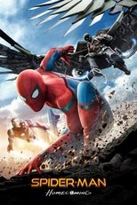
Spider-Man
2002
<p>This and the <i>Spider-Man: Homecoming</i> poster are very similar (mainly just the pose and the villain flying above). But it also reflects my mutual feelings between them, with how much of a solid start that these 2 variants have in their own universe.</p>
Terrifier
2016
I cannot stress enough that I didn’t choose this poster because I’m some edge lord gooner, but because it actually reflects the tone of the movie. Plus that death scene was hardcore af.

Transformers: Rise of the Beasts
2023
<p>It’s the only good <i>monke</i> poster that I can find.</p>


The Twilight Saga: Eclipse
2010
Edward kinda becomes a beta soyboy cuck and tries to kermit soup-sides after he thinks Bella done game ended herself. Meanwhile, Sharkboy took matters to his own hands and brought out his true inner Animality🐺
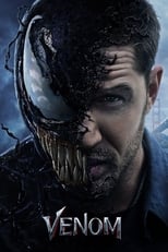
Venom
2018
Sony = Venom<br>Spider-Man = Me<br><br>I’ve been dunked on by Sony for watching this movie (twice). Also it’s a funny meme poster lol
War of the Worlds
2025
Please Letterboxd, don’t remove this poster 😩😩😩 <b>Edit:</b> They fucking removed it. It was a fan poster that had Jeff Bezos in the middle, a small Ice Cube on his shoulder, and the tagline on the bottom that says “Sponsored by late-stage capitalism”. They even removed the background image that had “LIVE ICE CUBE REACTION”. We can’t have nice things.

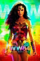
Wonder Woman 1984
2020
Gal Gadot smiling away all the selfless wishes that people made, just like irl


Comments